


Colour: Very Much A Grey Area
The reality of how we perceive colour; the visual effects of how colours mix, match or contrast along with the emotions they elicit is something of a science as well as an art, depending on which camp you are in. As our understanding has evolved, our knowledge of colour as a concept has become somewhat murkier; a much greyer area, simply because we do not all see colour in the same way.
The story of colour is one that is in a perpetual state of discovery. The synopsis reads; at the beginning of the Renaissance the use of colour in art and design is first referenced by artists Leon Battista Alberti and Leonardo da Vinci. Both advocate for a hierarchy of colours from which all others can be mixed. Thereafter the invention of new pigments accompanies the developments of art history’s greatest movements. Artists experiment with colours never seen before in the history of painting while scientists develop more systematic and rigorous methods for studying colour. It isn't until the 18th century that Isaac Newton's experiments with sunlight and prisms demonstrate that white light is a combination of all colours across the spectrum. No one really questions Newton's ideas about light and colour until an unlikely challenge is made by German poet, philosopher and artist Wolfgang von Goethe in the early 19th century. Here the plot thickens.

Goethe proposes a more human-centred, subjective approach to the sensation of colour reaching our brain and considers not just the mechanics of human vision but also the way our brains process information to perceive colour.
Worthy of more than a modest mention in a footnote, but often relegated to this position simply because very little is known about her, is the character Mary Gartside. Post Newton, and preceding Goethe, Mary Gartside, an English watercolour teacher and painter, is the first woman of the time, quietly engaging in contemporary debate to produce a complete theory of colour. Gartside, a woman ahead of her time, draws many of the same conclusions about the significance of light and shade, colour harmony and contrast and the sensory effects of colour that Goethe arrives at five years later.
Artistic and scientific strands exploring colour theory run concurrently until the arrival of Johannes Itten at the influential Bauhaus school of art and design in Germany in 1920's. In a hothouse of cutting edge ideas, the Bauhaus masters mobilise and explore light, colour and form with fresh energy and creative rigor. The world of colour for Itten (and others including, Vassily Kandinsky, Paul Klee, Josef Albers and Mies Van Der Rohe) is a medium to express emotions rather than simply to depict reality. In short, the work emanating from this creative movement is so foundational that it continues to underpin everything we think of as contemporary colour theory.

The tale does not conclude in tangible simplicity ever after, rather like any good story it leaves us with more questions. Much like our understanding of colour today which is more slippery and hard to define because we now understand the human response to colour as unique to each individual. In reality, we perceive colours differently not just physically but also deeply rooted in personal and cultural experiences.
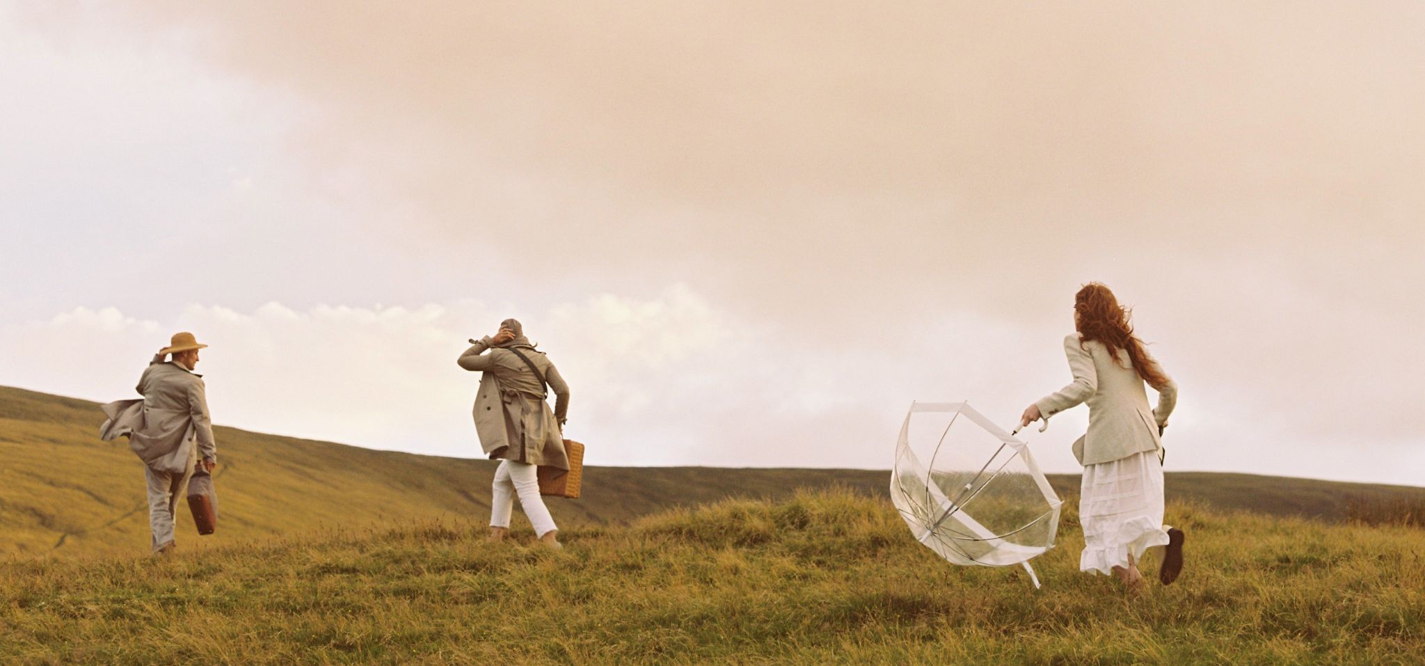
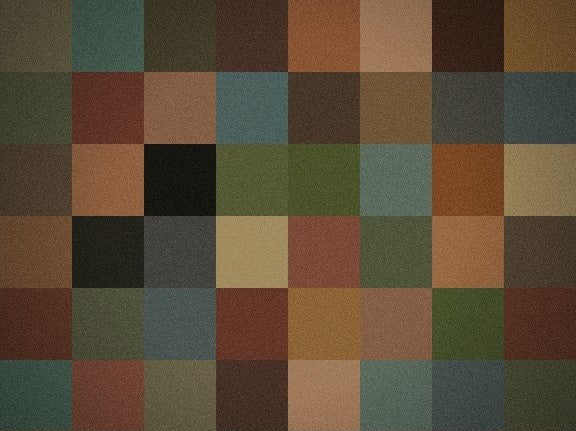
While the study of colour remains an interdisciplinary field encompassing art, physics, chemistry, biology, and psychology, as designers, what we are searching for is a palette with emotional quality; a quality that resonates. With every new design, discussion relating to colour and colour combinations always centres around meaning, the memories colours evoke and the visual weight they carry. It is not easy to grasp on to the experiences of colour; what works, what doesn’t and how colours communicate to evoke a particular emotion, vibe, or aesthetic. We deploy colour, as well as lines, shape, and texture to create a sensory experience to evoke an emotional response that leaves a deep impression.

Our latest two-tone colour series is a celebration of colour and colour harmonies. Each time we tested colour combinations in the early design phase, our excitement rose. The colours don’t stray too far from the signature RUSKIN palette but thoughtfully combined, they interact with each other to stir that 'inner resonance'.


